2. Usage examples
2.1. Logic operations
This simple example shows some logic operations supported by the BITIS module.
1 2 3 4 5 6 7 8 9 10 11 12 13 14 15 16 17 18 19 20 21 | import bitis as bt
## Check the equation: a xor b = a and not b or not a and b
# create two random signals
a = bt.noise(0,0,100,period_mean=10,width_mean=3)
b = bt.noise(-10,-10,90,period_mean=4,width_mean=2)
# direct xor
xor1 = a ^ b
# xor from equation
xor2 = a & ~b | ~a & b
# check results
if xor1 == xor2:
print 'Success!'
else:
print 'Failure!'
#### END
|
2.2. Graphic and semigraphic plot
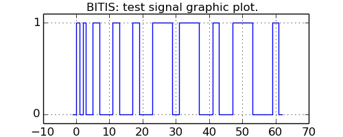
The following example shows the plotting capabilitites of methods plot and plotchar. The method plot uses the matplotlib to produce graphic drawing of the given signal as a square/rectangular wave. The x axis represents the time, the y axis represents the logical levels. The method plotchar uses the box line drawing characters from unicode for drawing the best approximation of a graphic representation of the given signal. Below there are two representations of the same test signal.
1 2 3 4 5 6 7 8 9 10 11 12 13 14 15 16 17 18 19 20 21 22 23 24 25 26 27 28 29 30 31 32 33 34 35 36 37 38 39 40 41 | import bitis as bt
import locale
import matplotlib.pyplot as pl
import sys
import StringIO as SI
# init locale
locale.setlocale(locale.LC_ALL,"")
# a test signal
signal = bt.test()
# graphic plot
fig1 = pl.figure(1,figsize=(5,2))
pl.suptitle('BITIS: test signal graphic plot.')
pl.xlabel('time')
signal.plot()
pl.grid()
# save graphic plot to file
fig1.savefig('plot.png',format='png')
# sequence of semigraphic plots of increasing resolution
buf = SI.StringIO()
buf.write('BITIS: test signal semigraphic plot\n')
for width in range(1,77,5):
top, bot = signal.plotchar(width,max_flat=4)
buf.write('%3d ' % width + top + '\n')
buf.write(' ' + bot + '\n')
sys.stdout.write(buf.getvalue())
# save semigraphic plot to file
pfile = open('plot.txt','w')
pfile.write(buf.getvalue())
pfile.close()
if __name__ == '__main__':
pl.show()
#### END
|
This is the graphic plotting result using plot method.
This is the semigraphic plotting result using plotchar method. The figure shows a sequence of plotting of the same test signal with increasing resolution. Resolution is the length of the plotting character string, it is printed at line beginning and spans from only one chararacter until a string 76 characters long.
1 2 3 4 5 6 7 8 9 10 11 12 13 14 15 16 17 18 19 20 21 22 23 24 25 26 27 28 29 30 31 32 33 | BITIS: test signal semigraphic plot
1 ╻
┸
6 ╻╻╻╻┎┒
┸┸┸┸┚┖
11 ╻╻╻╻┌┰┐╻┌┐╻
┸┸┸┸┘╹└┸┘└┸
16 ┎┰┐╻┌┐┌┐┌┐┌┐┌┐ ╻
┚╹└┸┘└┘└┘└┘└┘└─┸
21 ╻╻╻ ╻ ╻ ┌─┰─┐ ╻ ┌─┐ ╻
┸┸┸─┸─┸─┘ ╹ └─┸─┘ └─┸
26 ╻╻┌┐┌┐ ┌┐┌──┐┌─┐ ┌┐┌──┐ ┌┐
┸┸┘└┘└─┘└┘ └┘ └─┘└┘ └─┘└
31 ╻╻┌┐ ┌┐ ┌┐ ┌──┐┌──┐ ┌┐ ┌──┐ ┌┐
┸┸┘└─┘└─┘└─┘ └┘ └─┘└─┘ └──┘└
36 ┌┰┐┌┐ ┌─┐ ┌┐ ┌───┐┌──┐ ┌┐ ┌──┐ ┌┐
┘╹└┘└─┘ └─┘└─┘ └┘ └──┘└─┘ └───┘└
41 ┌┰┐┌─┐ ┌─┐ ┌─┐ ┌───┐┌───┐ ┌┐ ┌───┐ ┌┐
┘╹└┘ └─┘ └─┘ └─┘ └┘ └──┘└──┘ └───┘└
46 ┌┐╻ ┌┐ ┌─┐ ┌┐ ┌───┐ ┌───┐ ┌─┐ ┌───┐ ┌─┐
┘└┸─┘└──┘ └──┘└──┘ └─┘ └──┘ └──┘ └───┘ └
51 ┌┐┌┐┌─┐ ┌─┐ ┌─┐ ┌────┐┌────┐ ┌┐ ┌────┐ ┌─┐
┘└┘└┘ └──┘ └──┘ └──┘ └┘ └───┘└──┘ └────┘ └
56 ┌┐┌┐ ┌─┐ ┌─┐ ┌┐ ┌────┐ ┌────┐ ┌─┐ ┌──x─┐ ┌─┐
┘└┘└─┘ └──┘ └───┘└───┘ └─┘ └───┘ └──┘ └────┘ └
61 ┌┐┌┐ ┌─┐ ┌─┐ ┌─┐ ┌──x─┐┌──x─┐ ┌─┐ ┌──x─┐ ┌─┐
┘└┘└─┘ └───┘ └───┘ └───┘ └┘ └───┘ └───┘ └──x─┘ └
66 ┌┐┌┐ ┌─┐ ┌─┐ ┌─┐ ┌──x─┐ ┌──x─┐ ┌─┐ ┌──x─┐ ┌─┐
─┘└┘└─┘ └───┘ └───┘ └────┘ └─┘ └────┘ └───┘ └──x─┘ └─
71 ┌┐┌┐ ┌──┐ ┌─┐ ┌─┐ ┌──x─┐ ┌──x─┐ ┌─┐ ┌──x─┐ ┌─┐
─┘└┘└─┘ └───┘ └────┘ └────┘ └──┘ └────┘ └────┘ └──x─┘ └─
76 ┌┐┌┐ ┌─┐ ┌─┐ ┌──┐ ┌──x─┐ ┌──x─┐ ┌──┐ ┌──x─┐ ┌─┐
─┘└┘└──┘ └────┘ └────┘ └───┘ └─┘ └────┘ └───┘ └──x─┘ └─
|
When resolution is too low to represent all signal transition edges, plotchar puts an heavy vertical line as symbol of multiple edges.
In this example, plotchar is called with the argument max_flat=4 . This means that a signal constant level elapsing more than 4 characters is compressed (in time) to be of length 4 characters. This characters drop is marked by the ‘x’ chararacter that can be seen in the last four semigraphic plots. When this happens, it is important to keep in mind that the x axis time scale is no more uniform.
2.3. Correlation Function
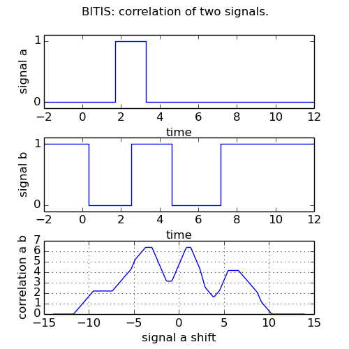
The following example shows the plotting of two random signals and their correlation function.
1 2 3 4 5 6 7 8 9 10 11 12 13 14 15 16 17 18 19 20 21 22 23 24 25 26 27 28 29 30 31 32 33 34 35 36 37 38 39 40 41 42 43 44 45 46 47 48 49 50 | import bitis as bt
import random
import matplotlib.pyplot as pl
# make repeatable random sequences
random.seed(1)
# create random signals
in_a = bt.noise(-2,-2,12,period_mean=6,width_mean=3)
in_b = bt.noise(-2,-2,12,period_mean=4,width_mean=2)
# compute correlation
corr_ab = in_a.correlation(in_b,step_size=0.1)
# start plotting
fig1 = pl.figure(1,figsize=(5,5))
pl.suptitle('BITIS: correlation of two signals.')
# plot signal a
pl.subplot(3,1,1)
pl.xlim(-2,12)
pl.ylabel('signal a')
pl.xlabel('time')
in_a.plot()
# plot signal b
pl.subplot(3,1,2)
pl.xlim(-2,12)
pl.ylabel('signal b')
pl.xlabel('time')
in_b.plot()
# plot correlation function
pl.subplot(3,1,3)
pl.grid()
corr, shift = corr_ab
pl.plot(shift,corr)
pl.ylabel('correlation a b')
pl.xlabel('signal a shift')
pl.subplots_adjust(hspace=0.4)
# save plot to file
fig1.savefig('correlation.png',format='png',)
if __name__ == '__main__':
pl.show()
#### END
|
This is the plotting result.
2.4. Serial signal
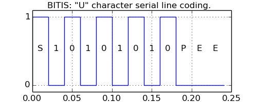
The following example shows the signal of an asynchronous serial interface coding the ASCII character “U” with 8 character bits, odd parity, 2 stop bits and 50 baud tranmitting speed.
1 2 3 4 5 6 7 8 9 10 11 12 13 14 15 16 17 18 19 20 21 22 23 24 25 26 27 28 29 30 31 32 33 34 35 36 37 38 39 40 | import bitis as bt
import matplotlib.pyplot as pl
CHAR_BITS = 8
PARITY = 'odd'
STOP_BITS = 2
BAUD = 50
TSCALE = 1.
chars = ['U']
timings = [0]
fig1 = pl.figure(1,figsize=(5,2))
pl.suptitle('BITIS: "U" character serial line coding.')
pl.xlabel('time')
bt.serial_tx(chars,timings,char_bits=CHAR_BITS,parity=PARITY,
stop_bits=STOP_BITS,baud=BAUD).plot()
bit_time = TSCALE / BAUD
pl.text(bit_time/2,0.5,'S',ha='center')
mask = 1
for c in range(CHAR_BITS):
if ord(chars[0]) & mask:
char = '1'
else:
char = '0'
pl.text((c + 1.5) * bit_time,0.5,char,ha='center')
mask <<= 1
pl.text((c + 2.5) * bit_time,0.5,'P',ha='center')
pl.text((c + 3.5) * bit_time,0.5,'E',ha='center')
pl.text((c + 4.5) * bit_time,0.5,'E',ha='center')
pl.grid()
# save plot to file
fig1.savefig('serial_tx.png',format='png')
if __name__ == '__main__':
pl.show()
#### END
|
This is the plotting result. The x axis units are milliseconds.
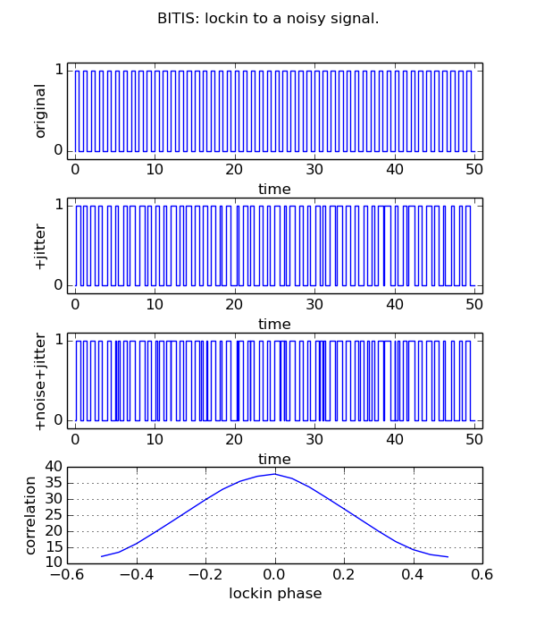
2.5. Phase lockin
The following example demonstrate a phase recovery from a disturbed periodic signal whose undisturbed original is known. The original signal is a square wave of 50 cycles @1Hz, 50 % duty cycle. A gaussian jitter is added to the original signal change times and the result is xored with noise pulses to simulate transmission line disturbances.
1 2 3 4 5 6 7 8 9 10 11 12 13 14 15 16 17 18 19 20 21 22 23 24 25 26 27 28 29 30 31 32 33 34 35 36 37 38 39 40 41 42 43 44 45 46 47 48 49 50 51 52 53 54 55 56 57 58 59 60 61 62 63 | import bitis as bt
import random
import matplotlib.pyplot as pl
# make repeatable random sequences
random.seed(1)
# generate the original signal: square wave, 50 cycles @1Hz, 50% duty cycle.
original = bt.square(0.,0.,50.,1.,0.5)
# add jitter to original signal
jittered = original.clone()
jittered.jitter(0.1)
# add noise by xor
jittered_noised = jittered ^ bt.noise(0,0,50,period_mean=5,width_mean=0.5)
# compute correlation between original and disturbed signal
corr, shift = original.correlation(jittered_noised,step_size=0.05,
skip=49.45,width=1.05)
# start plotting
fig1 = pl.figure(1,figsize=(6,7))
pl.suptitle('BITIS: lockin to a noisy signal.')
# plot original signal
pl.subplot(4,1,1)
pl.xlim(-1,51)
pl.ylabel('original')
pl.xlabel('time')
original.plot()
# plot signal with jitter
pl.subplot(4,1,2)
pl.xlim(-1,51)
pl.ylabel('+jitter')
pl.xlabel('time')
jittered.plot()
# plot signal with jitter and noise
pl.subplot(4,1,3)
pl.xlim(-1,51)
pl.ylabel('+noise+jitter')
pl.xlabel('time')
jittered_noised.plot()
# plot correlation function
pl.subplot(4,1,4)
pl.grid()
pl.plot(shift,corr)
pl.ylabel('correlation')
pl.xlabel('lockin phase')
pl.subplots_adjust(hspace=0.4)
# save plot to file
fig1.savefig('lockin.png',format='png')
if __name__ == '__main__':
pl.show()
#### END
|
The plot shows the original, the disturbed signal and the correlation among them, correlation that reaches a maximum when the original has that same phase of the disturbed original.
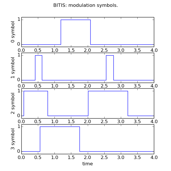
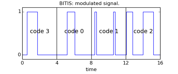
2.6. Modulation
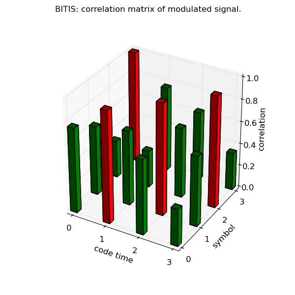
The following example shows the generation of a modulated signal, given a random code and a set of symbols. The modulated signal is obtained concatenating in time the symbol corresponding to a code value. Then the modulated signal is demodulated by maximal correlation symbol estimation. As a byproduct, the signal/symbols correlation matrix is obtained as shown below. The example does not take into account any signal alteration by noise.
1 2 3 4 5 6 7 8 9 10 11 12 13 14 15 16 17 18 19 20 21 22 23 24 25 26 27 28 29 30 31 32 33 34 35 36 37 38 39 40 41 42 43 44 45 46 47 48 49 50 51 52 53 54 55 56 57 58 59 60 61 62 63 64 65 66 67 68 69 70 71 72 73 74 75 76 77 78 79 80 81 82 83 84 | import bitis as bt
import random
import matplotlib.pyplot as pl
from mpl_toolkits.mplot3d import Axes3D
import numpy as np
SYMBOLS_NUM = 4
SYMBOL_ELAPSE = 4.
SYMBOL_PULSES_MEAN_PERIOD = 1.
SYMBOL_PULSES_MEAN_WIDTH = 0.5
CODE = [3,0,1,2]
# make repeatable random sequences
random.seed(1)
# generate symbols as random signals
symbols = []
for i in range(SYMBOLS_NUM):
symbol = bt.noise(0.,SYMBOL_ELAPSE,period_mean=
SYMBOL_PULSES_MEAN_PERIOD,width_mean=SYMBOL_PULSES_MEAN_WIDTH)
# ensure same start and end levels equal to 0
while symbol.slevel or symbol.slevel != symbol.end_level():
symbol = bt.noise(0.,SYMBOL_ELAPSE,period_mean=
SYMBOL_PULSES_MEAN_PERIOD,width_mean=SYMBOL_PULSES_MEAN_WIDTH)
symbols.append(symbol)
# modulate
mod = bt.code2mod(CODE,symbols)
# demodulate
decode, corr, corrs = bt.mod2code(mod,symbols)
# plot symbols
fig1 = pl.figure(1,figsize=(6,6))
pl.suptitle('BITIS: modulation symbols.')
for i in range(len(symbols)):
pl.subplot(4,1,i+1)
pl.xlim(0,SYMBOL_ELAPSE)
pl.ylabel('%d symbol' % i)
pl.xlabel('time')
symbols[i].plot()
# plot modulated signal
fig2 = pl.figure(2,figsize=(6,2.5))
fig2.subplots_adjust(top=0.9,bottom=0.2)
pl.suptitle('BITIS: modulated signal.')
pl.xlim(0,SYMBOL_ELAPSE*len(CODE))
pl.xlabel('time')
pl.xticks(np.arange(0,17,4))
pl.grid(axis='x',linestyle='-',linewidth=1)
mod.plot()
for c in range(len(CODE)):
pl.text(c*4+2 ,0.5,'code %d' % CODE[c],ha='center',size=14)
# plot correlation matrix of modulated signal
fig3 = pl.figure(3,figsize=(6,6))
pl.suptitle('BITIS: correlation matrix of modulated signal.')
ax = fig3.gca(projection='3d')
x, y = np.mgrid[0:len(CODE),0:SYMBOLS_NUM] - 0.1
x = x.flatten()
y = y.flatten()
z = np.zeros_like(x)
pl.xlabel('code time')
pl.ylabel('symbol')
ax.set_zlabel('correlation')
dz = np.array(corrs).flatten()
pl.xticks(np.arange(4))
pl.yticks(np.arange(4))
cz = ['g']*len(z)
for i in range(len(cz)):
if dz[i] > 0.9:
cz[i] = 'r'
ax.bar3d(x,y,z,0.2,0.2,dz,color=cz)
# save plots to files
fig1.savefig('modem1.png',format='png')
fig2.savefig('modem2.png',format='png')
fig3.savefig('modem3.png',format='png')
if __name__ == '__main__':
pl.show()
#### END
|
The plot shows the set of four random symbols. Each symbol has an elapse time of 4 seconds.
The plot shows the modulated signal with the boundaries between the symbols. For each symbol time, the code value is shown.
The plot shows the symbol correlation matrix of the modulated signal. The correlation value reaches the maximum where the correlating symbol is equal to the modulating symbol. For each code time, the symbol with maximum correlation (+1) is marked in red.